
Spoiler Alert
Welcome Judges!
If you've come to this page that means you're an artist here to see what I'm all about it. I hope you like what you find here. If you do, feel free to contact me. I'm always open to meeting new people.
Something to Remember me by
In order to make the biggest impact on the lovely judges' minds, I left something behind that would hopefully help everyone remember me. The images below were assembled in a flipbook that were kept safe in bright and personally addressed envelopes.
In these small pages I aimed to pack as much information and personality possible, I sincerely hope I succeeded.


GRD 3000: Introduction to Graphic Design
Semester: Fall 2014 Instructor: Taylor
Project 1: Personal Logo


Creative Brief:
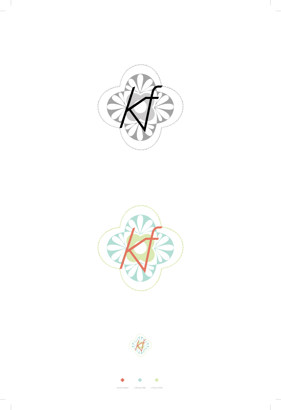
Explanation For my personal logo I wanted to convey my artistic style and personality in the cleanest manner possible. My illustrative logo was heavily influenced by Moroccan tiles and Mediterranean color schemes. My typographic logo, my personal favorite, is the simple combination of my first and last initials using a bold Bell Gothic font. The fragmented pieces are to both reflect my inspiration as well as a personal parallel to my own identity.
Revisions
I chose not to revise my typographic logo, however my illustrative version was heavily revised. I worked to further simplify the shapes and to use more negative space.
Project 2: Collage Ads


Creative Brief:
Explanation I chose Hard Rock Cafe for its attitude and its passion for music. Initially, I wanted to create an entire environment for each ad. I took the company’s goal of showcasing a great musical legend by literally framing a particular artist. Each image contains a rope barrier to communicate its importance. The sticker became my invitation for the viewer to put him or herself into the scene-to connect with the ad and the company.
Revisions Unfortunately, first designs were poorly executed, vague, all while the artifice was apparent. Instead I decided to simplify my goals and give the impression of space without attempting to convince the viewer. I used jewel tones to align with its current ad color schemes as well as a nod to royalty.
Project 3: Event Poster


Creative Brief:
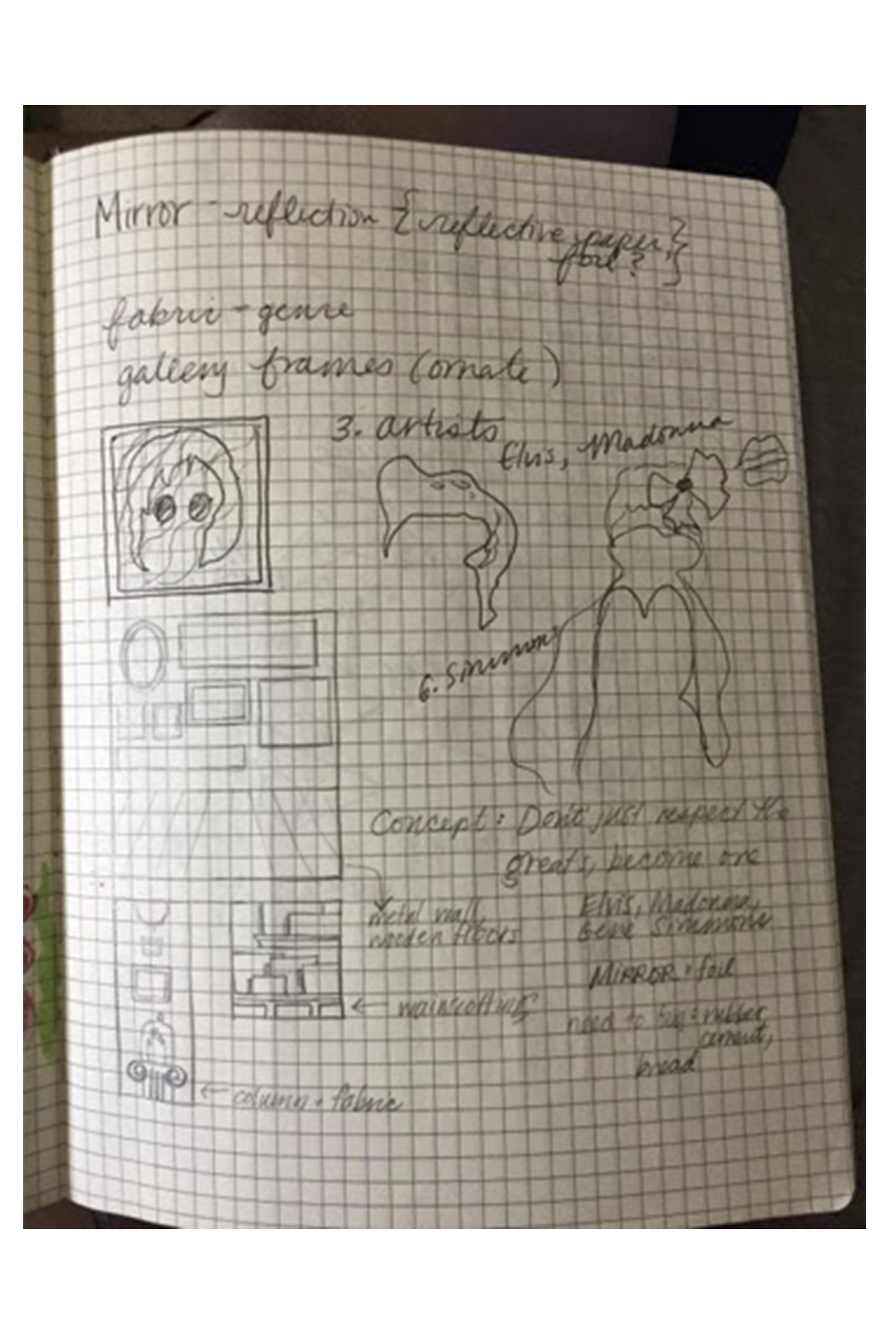
Explanation For me, Local Natives' music feels so deeply personal, like an outpour of emotion. For my favorite band Local Natives I decided to showcase a particular event in Malaysia. I was inspired by the native batik floral fabric patterns and its rich color palette. I decided to sketch the band members in the moment of singing and expression and to show the music as pouring out of their mouths with design.
Revisions For the second go around I deepened the color palette to create greater contrast between the atmosphere and the shocking yellow of the designs. Instead of using a halftone effect, I made my own using a vector shape overlay. This gave me more control over the effect, while keeping the image visually intact and maintaining the speckled effect.
Project 4: Book Cover

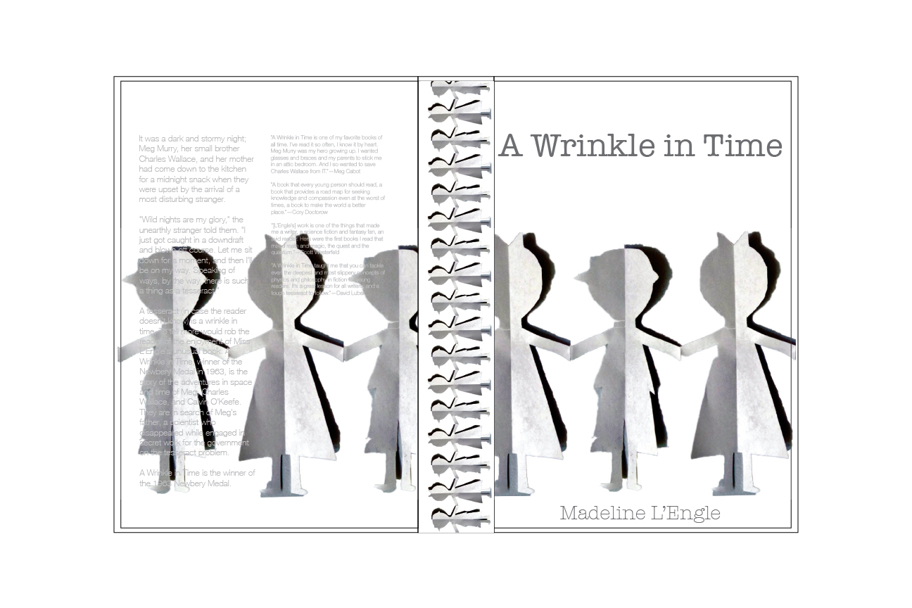


Creative Brief:
Explanation I chose Madeline L'Engle's A Wrinkle In Time since it was one of my childhood favorites-it had such a distinctly eerie and wondrous mood. My initial designs focused a geometric version of a mathematical concept: a tesseract, which plays a prominent role throughout the book. As a child I was fascinated and I believed the book's concepts since they were based on math. (: I chose a vintage color palette of salmon and teal, but my peers voted it out, didn't understand my point of view calling it a textbook.
Revisions I kept the central image but used a deeper more dramatic color scheme to reflect space and the book's odd mood. Additionally I had more time to get a truer representation with paper choice and more precise measurements. I'm confident in the 3D mockup especially in comparison to the first.
Project 5: Package Redesign


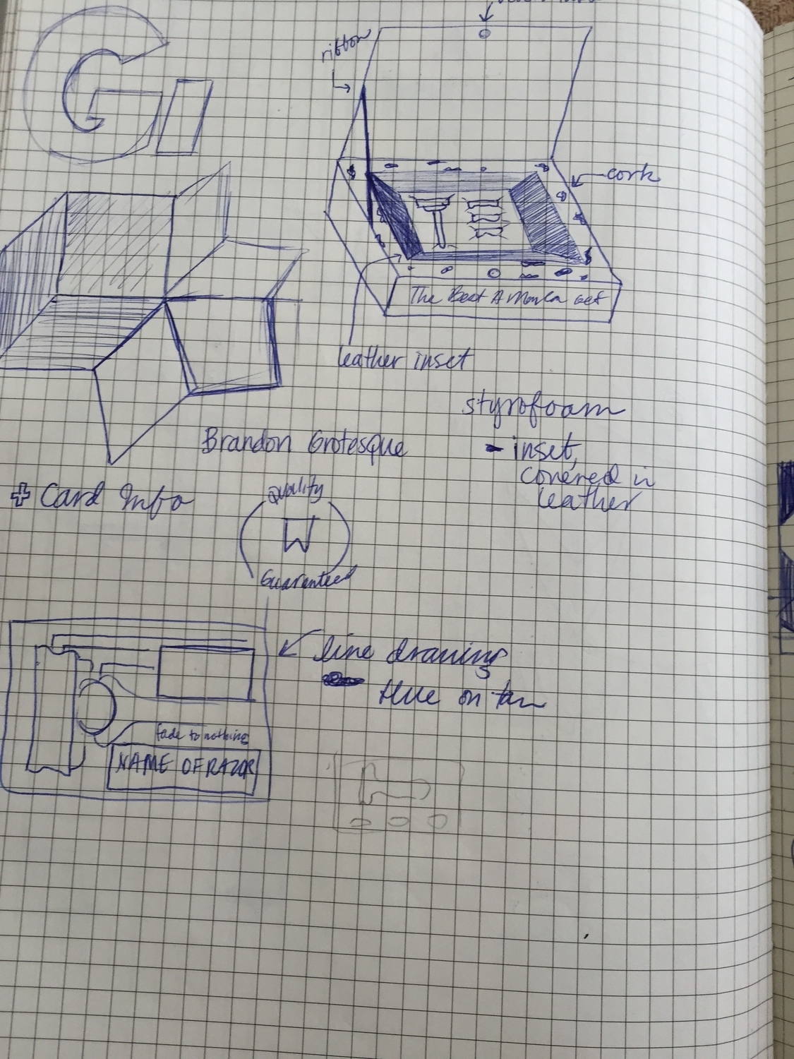

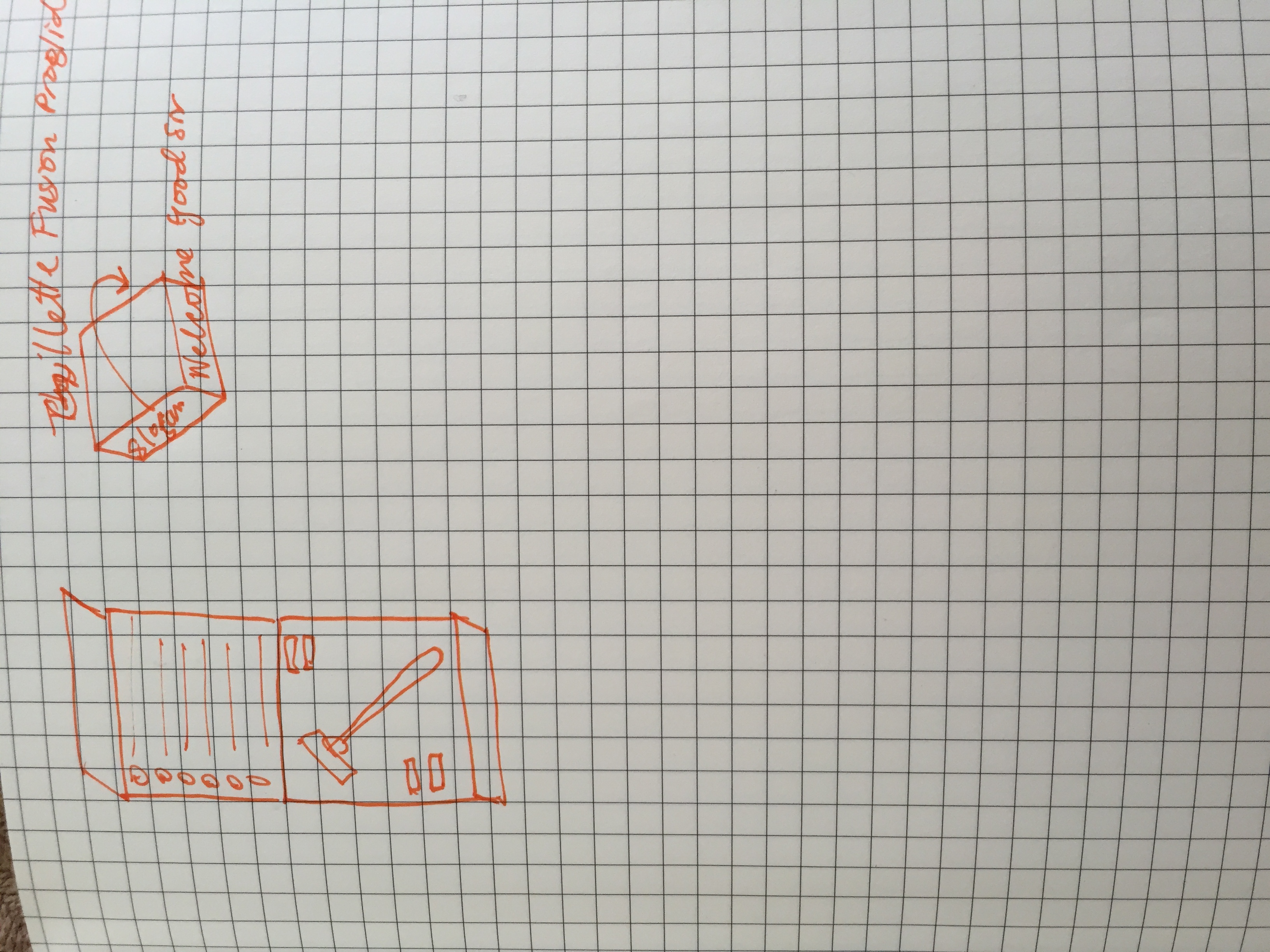
Creative Brief:
Explanation For the repackaging project I chose to give new life to Gillette Fusion ProGlide razor & refills. I chose a font reminiscent of the cool razor company Harry's and really tried to emulate their simple yet masculine aesthetic. My goal was to design something so attractive even the clueless (design wise) men in my life could appreciate its appeal, while remaining cost effective.
Revisions My first go at it strayed from the original intent as the materials I attempted to use were expensive and proved to difficult to work with. My final revision cut out all of the poor craft and weird paper choices for a redesign based on typography. Using Brandon Grotesque, I aimed for a slightly irreverent yet classic approach to an every-man necessity. Instead of having a separate instruction manual like I designed before, I adhered them to the inside as another motivation for keeping a reusing the original packaging. I'm proud of the redesign, especially in comparison to the poor craft of my first version.
GRD 3150: Introduction to Typography
Semester: Spring 2014 Instructor: Snape
Project 1: Type Progression


Creative Brief:
Explanation My progression was from secular to religious. I showcased the individual, isolated, and confused with a progression into religion. While the progression ends in community, there are still conflicting emotions and concerns. The border not only encompasses the piece but also stands for society’s ever intrusive rules and standards that we all have to abide by.
Revisions While my initial color scheme was intended to be tribal, it came across as "Christmas-y" so I deepened the colors and swapped the hunter green for a warm brown. I also moved the labelling system from the second to the third panel to redistribute the weight as well as to integrate it more fully. While the labelling system was distracting before, the revision houses it naturally, in my opinion. Even though most peers crowded the third panel, I really wanted there still be lots of negative space as a character in the story. It was important for this piece to be deeply symbolic as it reflects my own personal struggles with religion and a my own sense of identity.
Project 2: Quote Poster

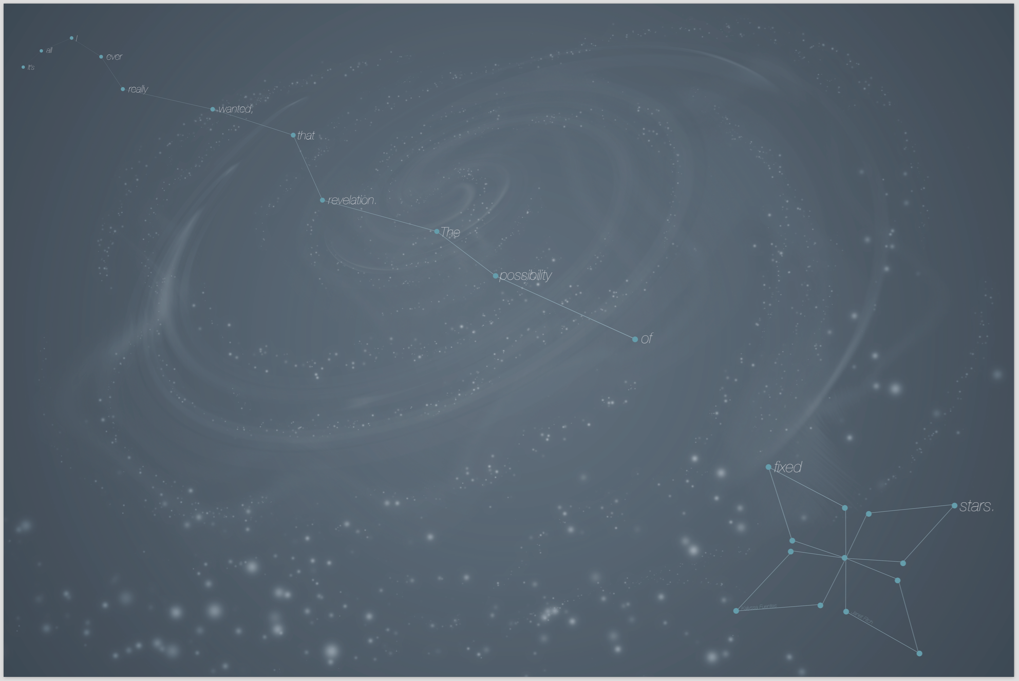

Creative Brief:
Explanation I used my favorite book White Oleander (you should definitely give it a read) and much later I realized I used this same quote for my senior quote (from High School. Embarrassing I know). Initially I focused on the image as opposed to the typography which made the composition weak overall. The colors conveyed a dreary and desolate mood and wasn't inviting nor was it a good ad for the book itself. Sorry.
Revisions First I changed my color scheme to a much brighter and deeper set of blues. My type placement reflects the protagonist’s inner turmoil and perpetual unbalance. I worked hard to give a sense of displacement and unease without discouraging viewers. Using the different weights of Helvetica Neue I emphasized the different words to mimic the emotional impact and importance. The background is a simplified star pattern as opposed to the overly illustrative background of the first version.
Project 3: Type Specimen Booklet


Creative Brief:
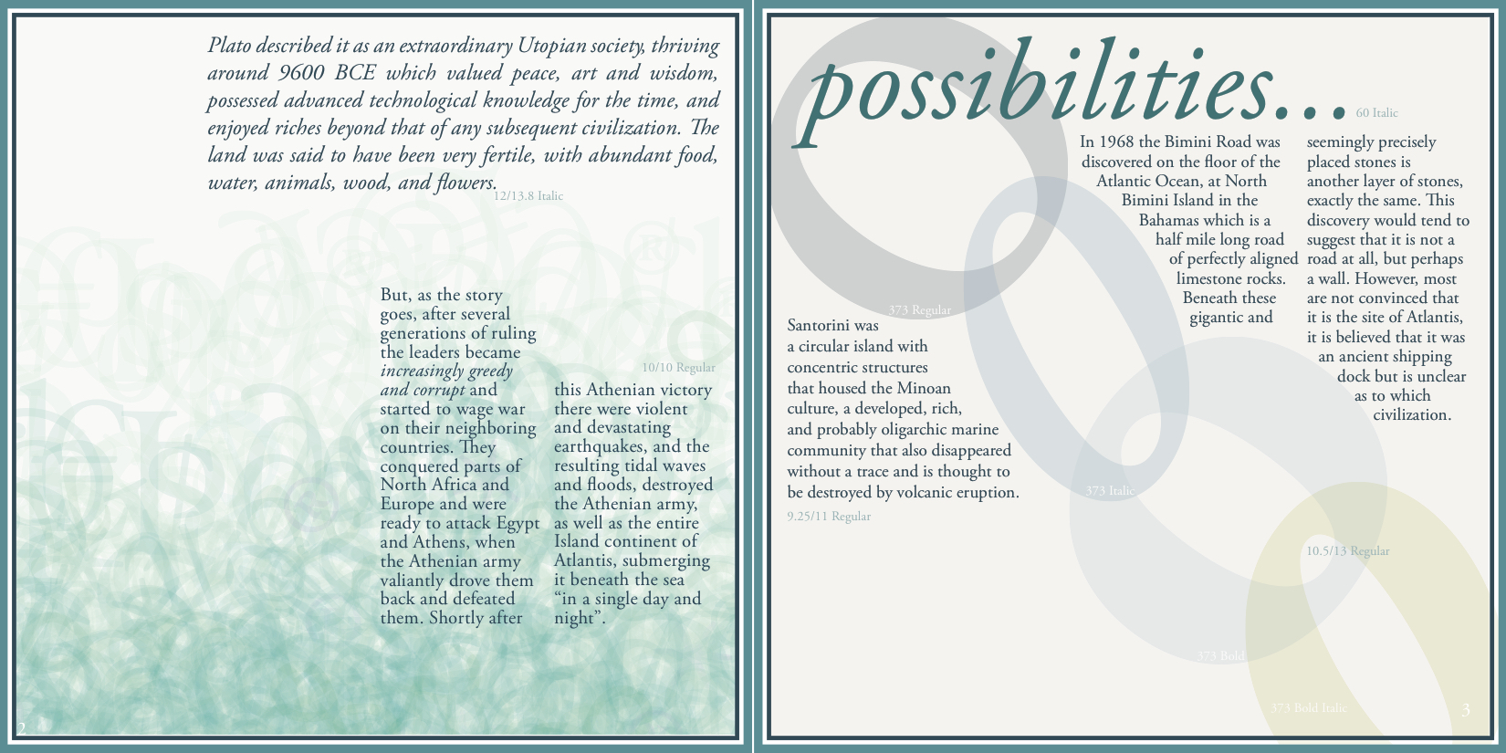
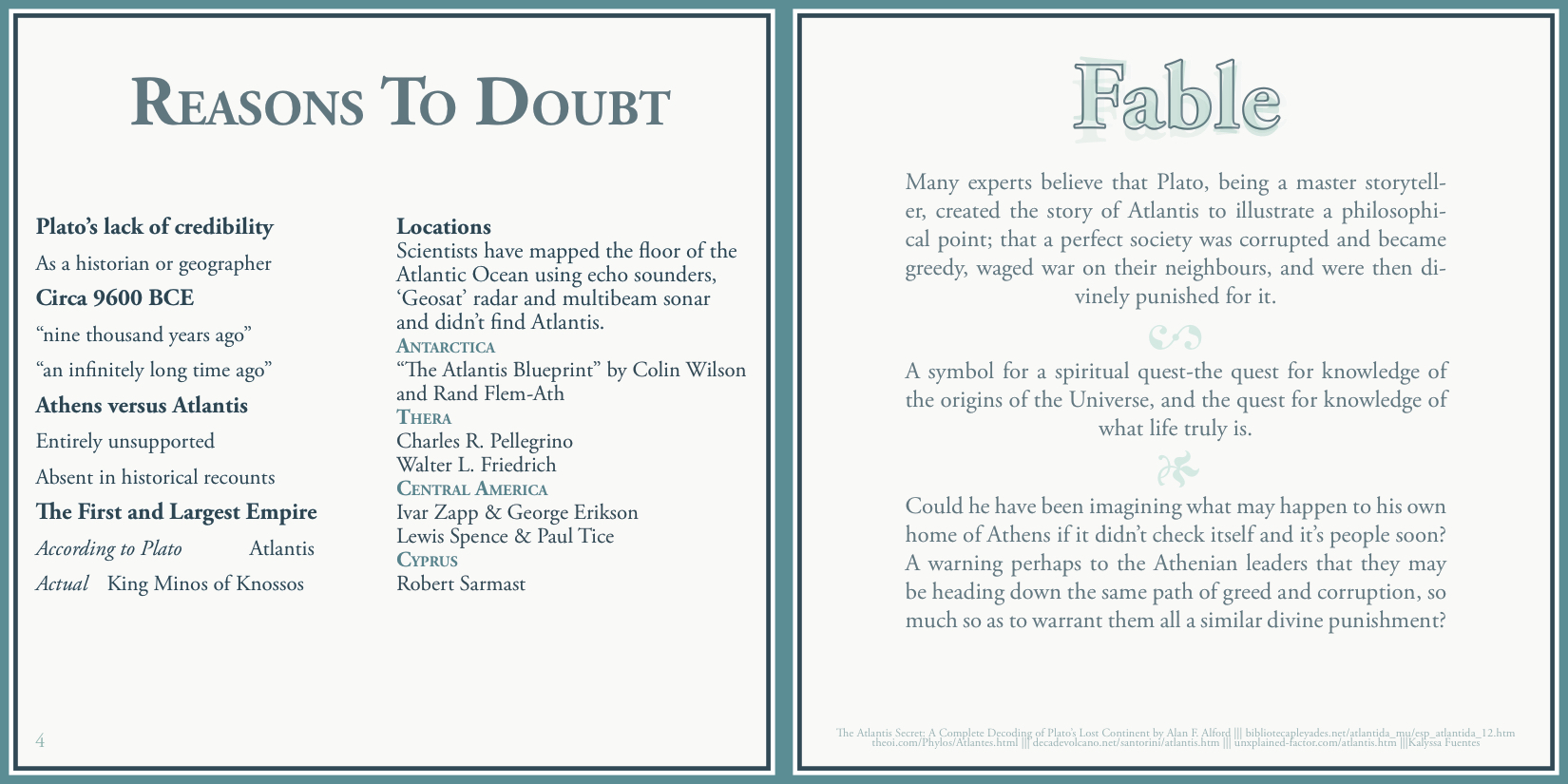
Explanation: I chose to focus on the city of Atlantis. I chose Adobe Garamond Pro for its classic serifs. I stuck to a serene color scheme to reflect water and tranquility. While most advise against borders, I thought it was important to have an antiquated and classic feel to it, I mean Atlantis is supposedly ancient and divine.
Revisions: While my booklet was quite different than my classmates, I didn't feel like it was particularly weak. I went and took out some of the unnecessary illustrations that cheapened the feel of the first version. Certain pages received different layout treatments and each page was adjusted to better fit the internal grid and overall ease.
GRD 3200: Intermediate Graphic Design
Semester: Spring 2015 Instructor: Warren
Creative Brief:
Products & Services
Custom Scented Products; Body wash, Massaging Oils, Lotion; Gift Baskets & Sets; Fragrance; Incense, Oil Diffusers, Candles, Potpourri, Burning Oils; Skin Care; Bath & Body; Hair; Makeup;
Target Market/Audience
• Age: All
• Gender: All
• Location: Downtown, ATL with goals of digital expansion
• Income: Low-Medium
• Ethnic Background: All, primarily African
• Supportive of Local Businesses
• Eco-friendly/minded
• Value quality & mindful of ingredients
Company Biography & History
• Sisters: Mary & Azeb Abay
• 8 years total (3 kiosk, 5 store)
• Extremely selective, diligently researched products, some straight from Africa
• Goals: Create personal line of products; Renovate a small area to create a family-friendly clubhouse and store
Competition
Wholefoods- Mid-Upper class; Eco-friendly, organic, local. Beauty supply stores- Cheaper prices
Company Morals: ValuesExtremely selective; Only the best products; Competitive Pricing; Known for customer service;
Current Identity
• Business Card: Floral designs; Deep blue color scheme
• Store Sign: Green & Pink, Tub overflowing with Flowers
• Interior: Pastel green paint, disorganized
Designer’s Premise, Intent
To maximize potential through design to help a local business
Designer’s Approach
Minimalist. Clean without being sterile. Earth-tone palette: greens & browns. Abstract image icon, emblem Modern
Key Words
1.Natural/ Eco-friendly/Green 2.Classy/Elegant 3.Unique/Memorable 4.Gentle 5.Fragrant 6.Dynamic/Abstract 7.Textured 8.Friendly/Caring 9.Discerning/Mindful 10.Hippies
Primary Words
1. Dynamic 2. Natural, Textured 3. Gentle
Post-Makeover Communicative Goals
• Classy
• Unique
• Welcoming atmosphere
• Eco-friendly
• Quality
Project 1: Logo


Creative Brief:
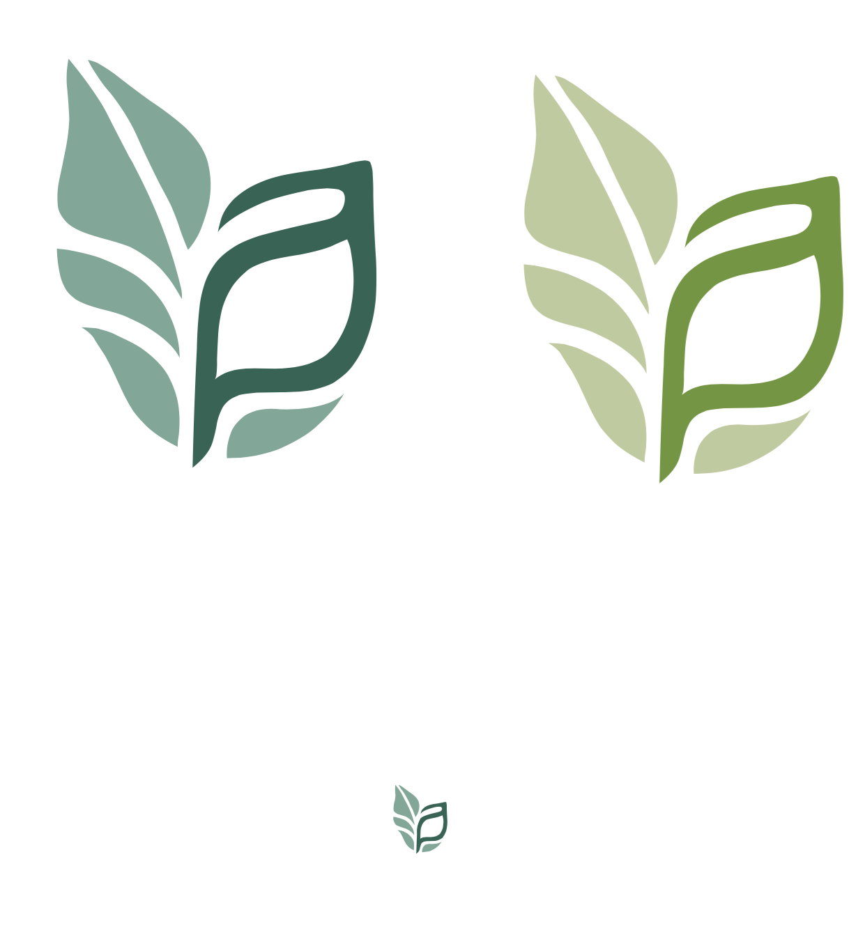
Explanation For this project I took it upon myself to truly stick to the owner's wishes. While I had lots of widely varying designs, I kept coming back to the combination of the A & P. I'm extremely proud of the final mark. I simplified it to two sections and colors while placing emphasis on the unique letter combination. For the full identity I stuck to the two fonts Sovba and Source Sans Pro and a restricted color scheme.
Revisions Due to creative advice I lengthened the descender of the letter combo in order to balance the prominence of the A with the P, this also works to emphasize the leaf shape of the mark.
Project 2: Stationery
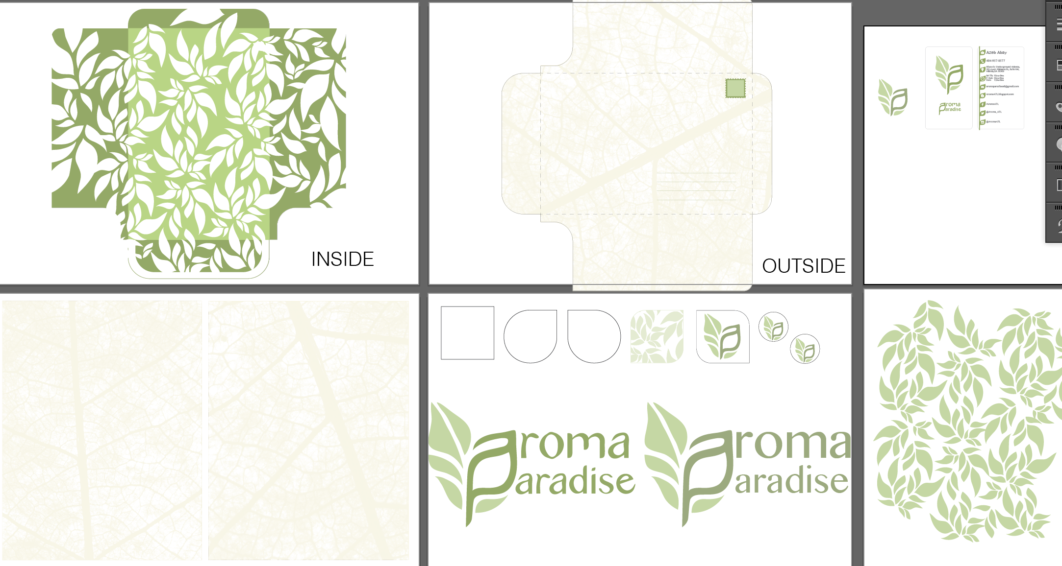


Creative Brief:
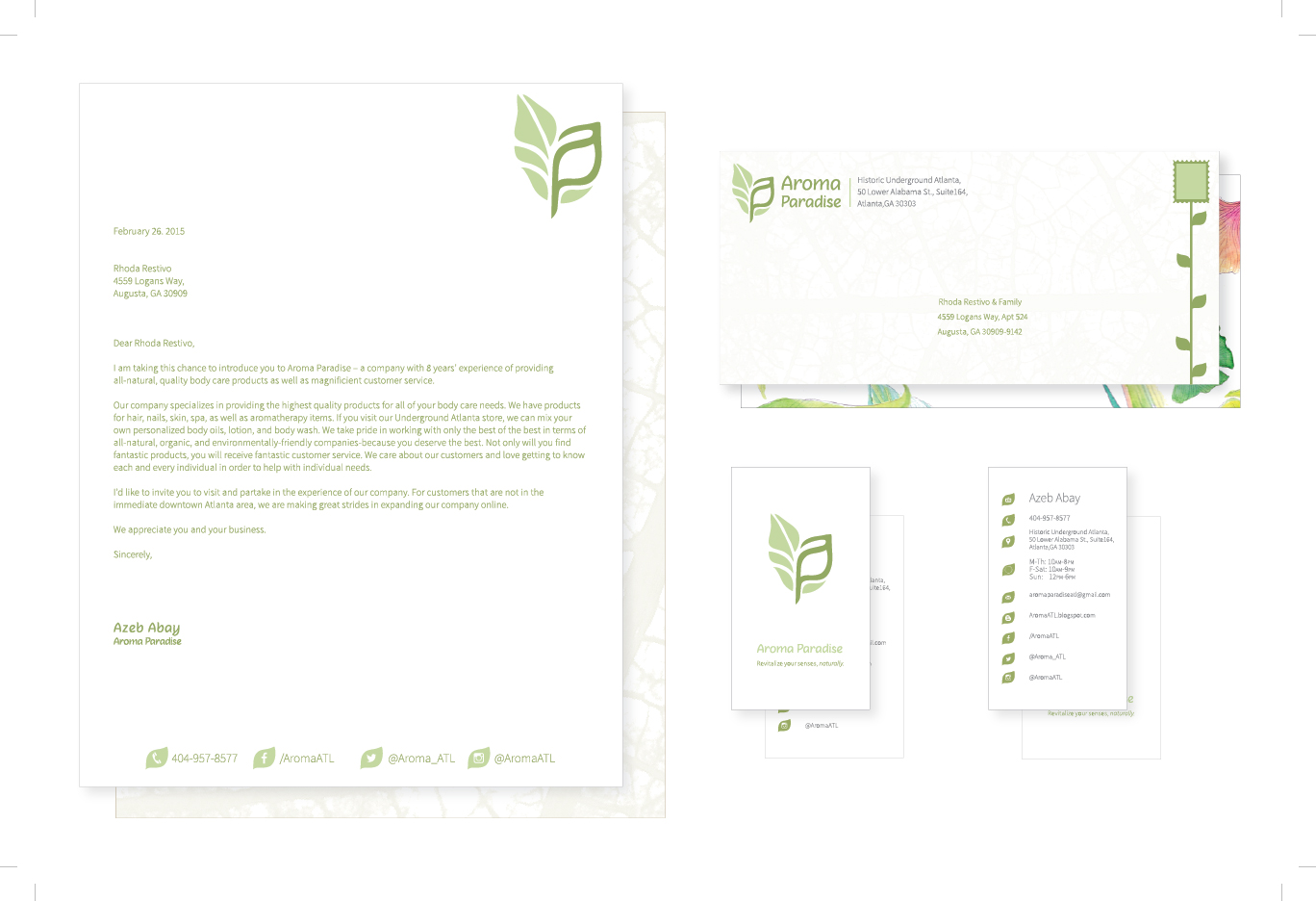
Explanation To drive home the visual aesthetic I really went wild on this stationery set. This led me to cover every surface with an HD photo of leaf veins edited to resemble a watermark. I introduced an unnecessary stock geometric pattern to the liner of the envelope and really was all over the place aesthetically.
Revisions I really listened to all of the criticism, and went back and simplified as best as I could without omitting crucial design elements. For the leaf watermark, I relegated it to the back of the letterhead and the outside of the envelope. At this point in time I'd decided on my two standard fonts and changed the text accordingly. For the liner of the envelope I placed my watercolored flowers to give a wonderful surprise for the customer, just something small and sweet. The business card was paired down and adjusted. I added the social media footer to the letterhead. My personal favorite is the little vine growing into the stamp, I think its really personal and unique. It takes a necessity and gives it a home in the visual identity.
Project 3: Ad Campaign
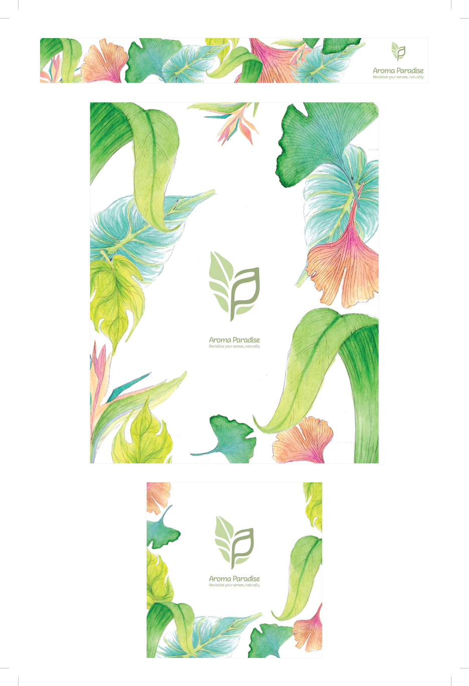


Creative Brief:
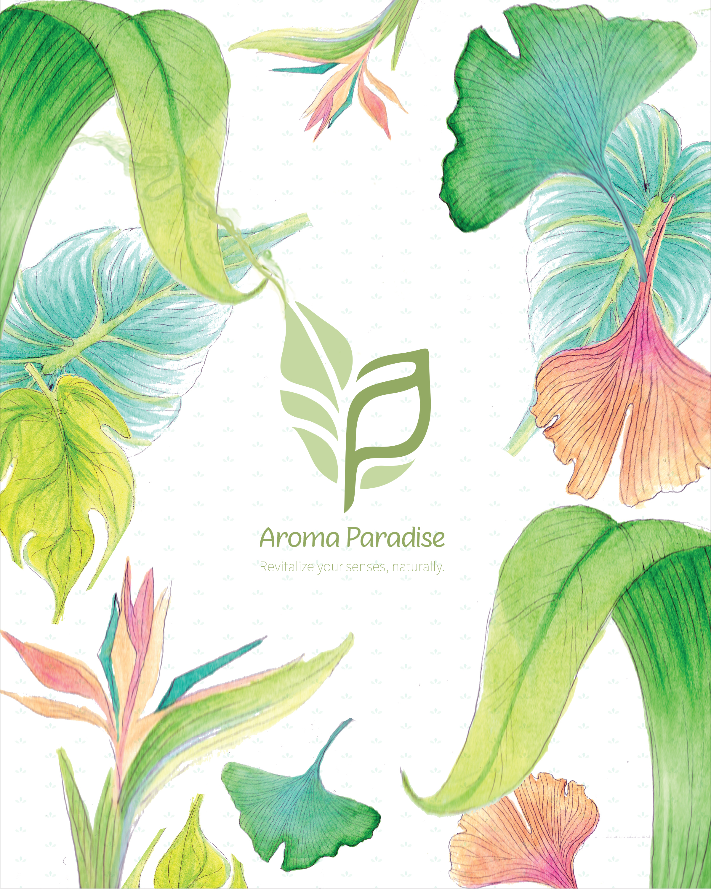
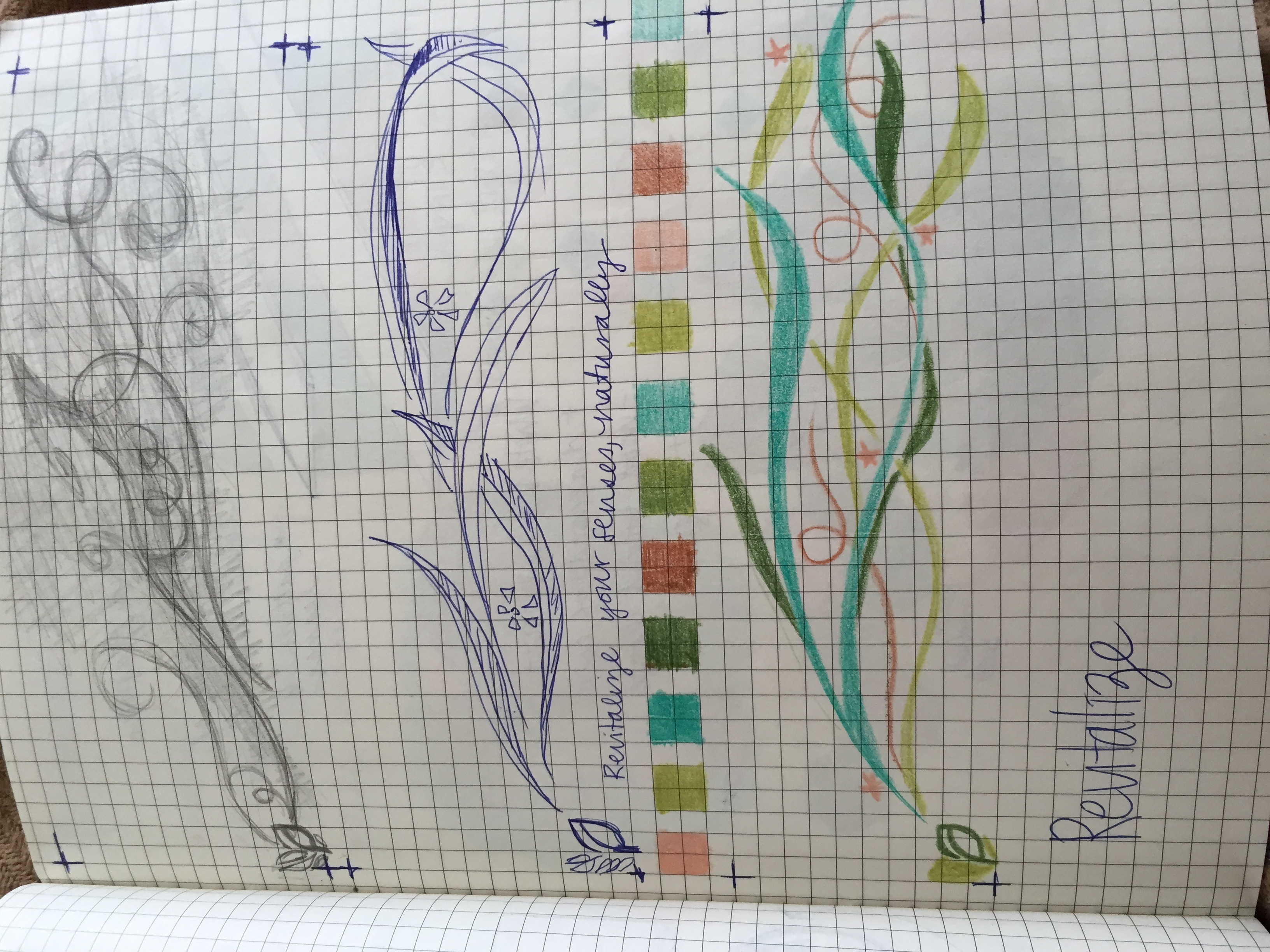
Explanation: I wanted to create an explosion of beauty, of paradise. I hand painted various tropical plants and placed these images to surround the logo. My initial approach was entirely too literal. I attempted to represent the title by having the logo give off an Aroma or scent of Paradise by way of tropical plants. Cheesy I know. So the first ads feature green 'smoke' coming from the logo and leading the paintings. To include the random geometric pattern from the envelope liner I also added it to the background. Also I added the tag line "Revitalize your senses, naturally."
Revisions: Once I nixed the silly literal approach I just focused on impacting the viewer with beauty. I removed the patterned background and kept the background white. Most of the internet and magazines are white, I felt like using that negative space would work to convince the viewer of the authenticity of the ad and therefore the products sold. I also fixed the weird pixelations of the first version and adjusted the sizing of the logo and its text.
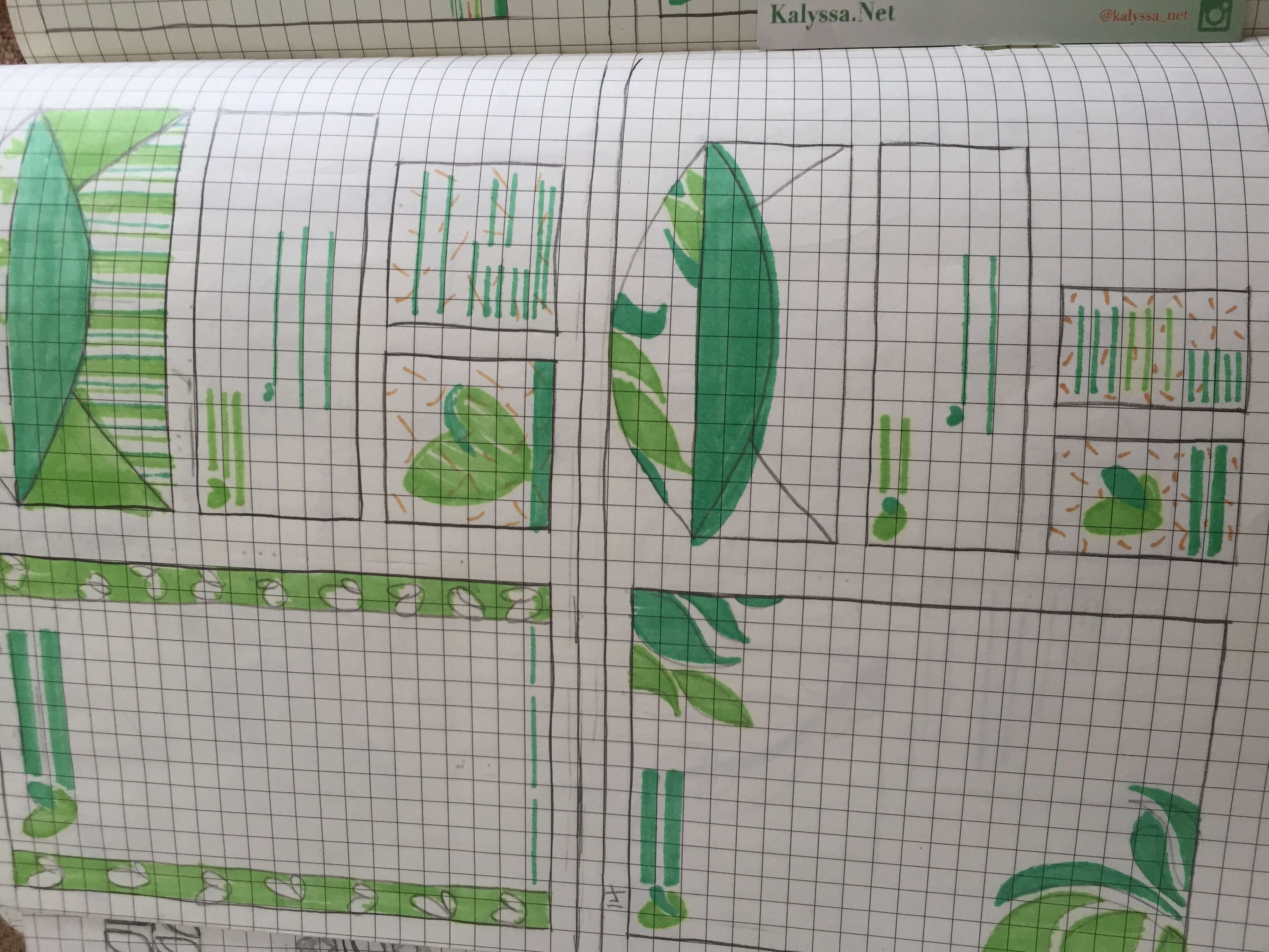
Project 4: Mailer


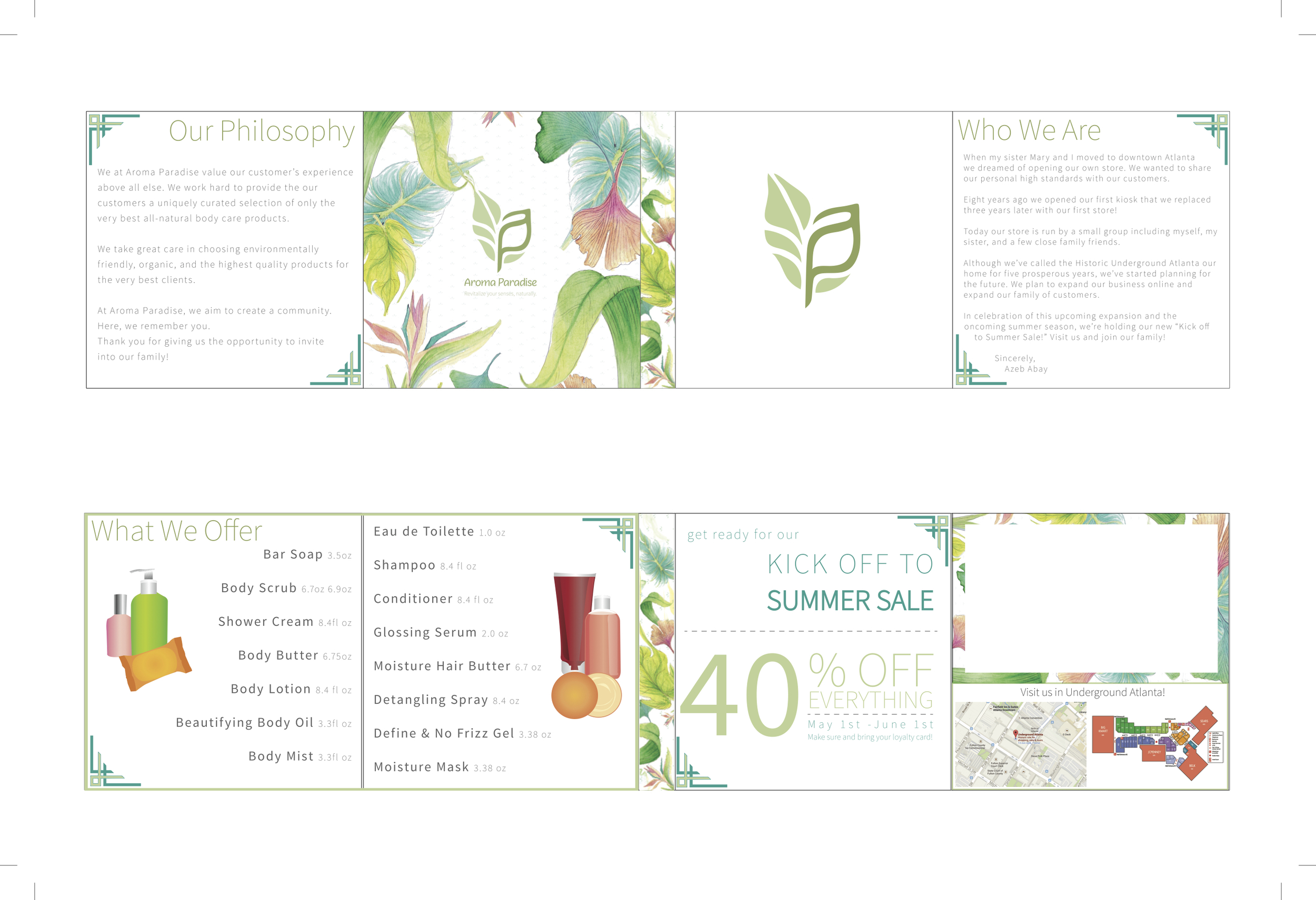


Creative Brief:
Explanation: For the fourth project I combined a mailer and collateral with my informational invitation to a sale event. Since Aroma Paradise is a very small business with a small family of customers, this mailer is intended to gain new customers by introducing the business and the owner. Due to paper choice and construction, the first version was too sturdy and required a sleeve to keep the mailer intact. In an effort to 'class it up' I added some decorative corners as well as designing some vector generic mockups for illustration.
Revision: Once I solved my paper issue I was able to nix the sleeve and incorporate the address on the front page of the mailer. Once opened the viewer is introduced to the business itself and its philosophy. Opening the page again lists some products offered as well as vector illustrations. The center of the mailer features a sample perfume that greets the viewer again. The next page advertises the actual promotional event while the last page features the loyalty card and some hand designed maps. The back page has a space for the owner's business card and another explosion of color with the painted elements. I stuck with my chosen fonts and a simple color scheme of green, gray, and a little blue here and there.
Project 5: Specialty Item


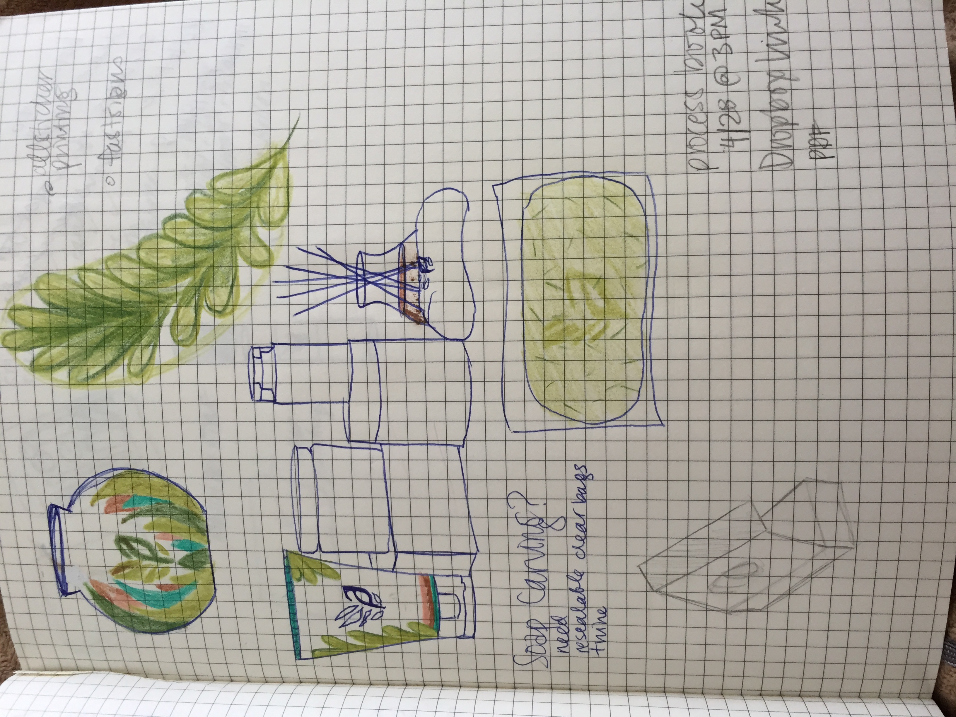
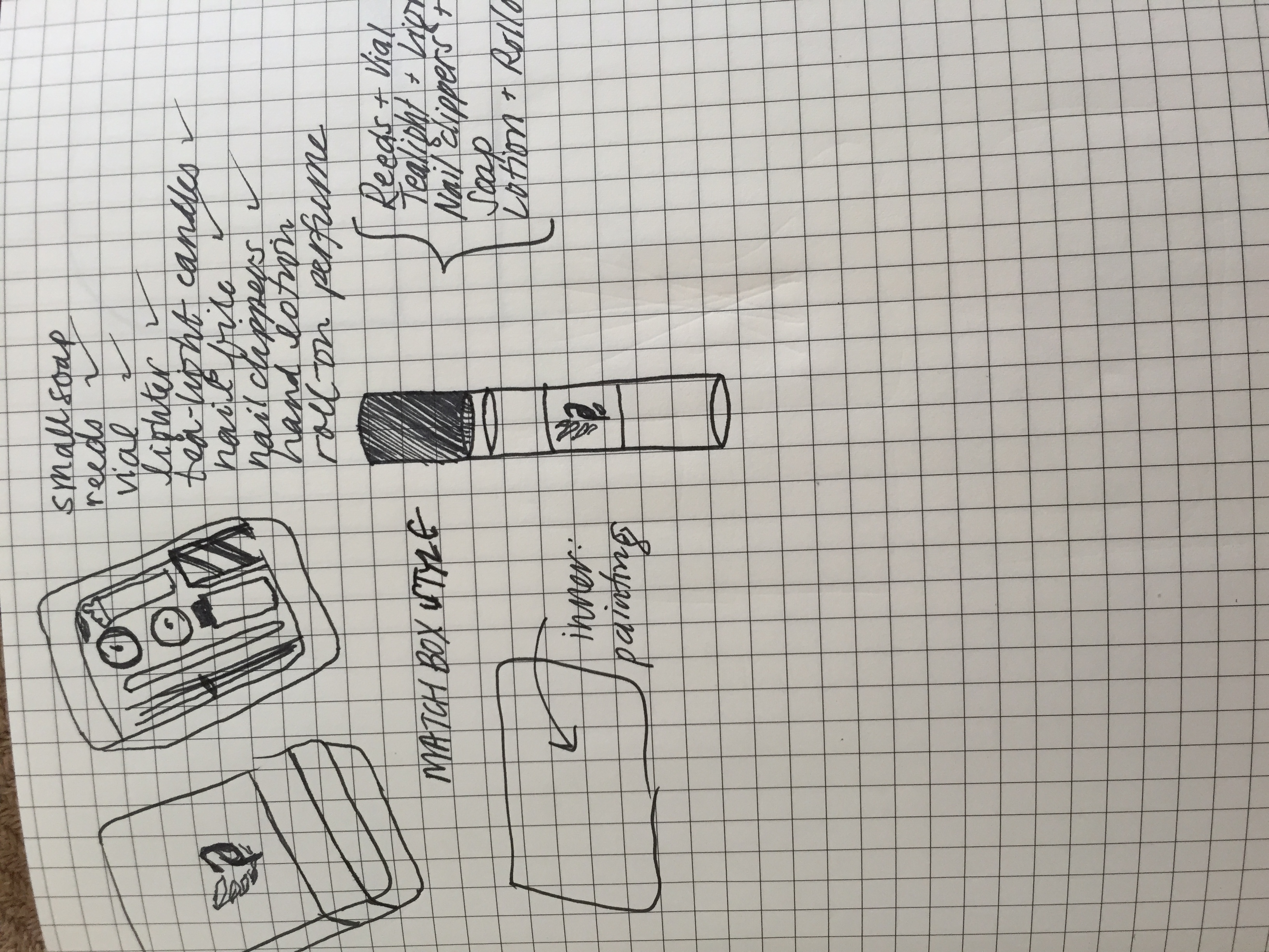
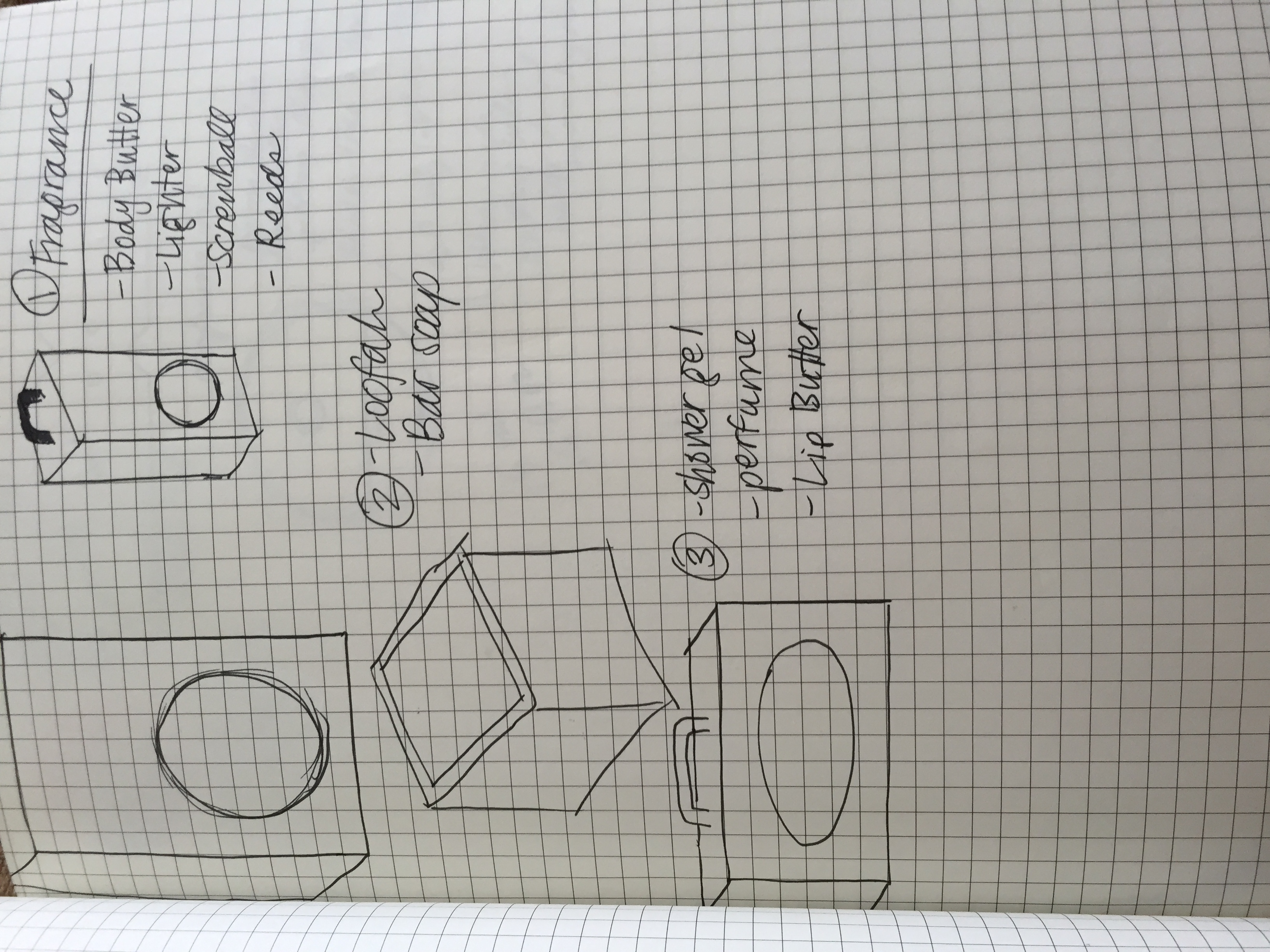
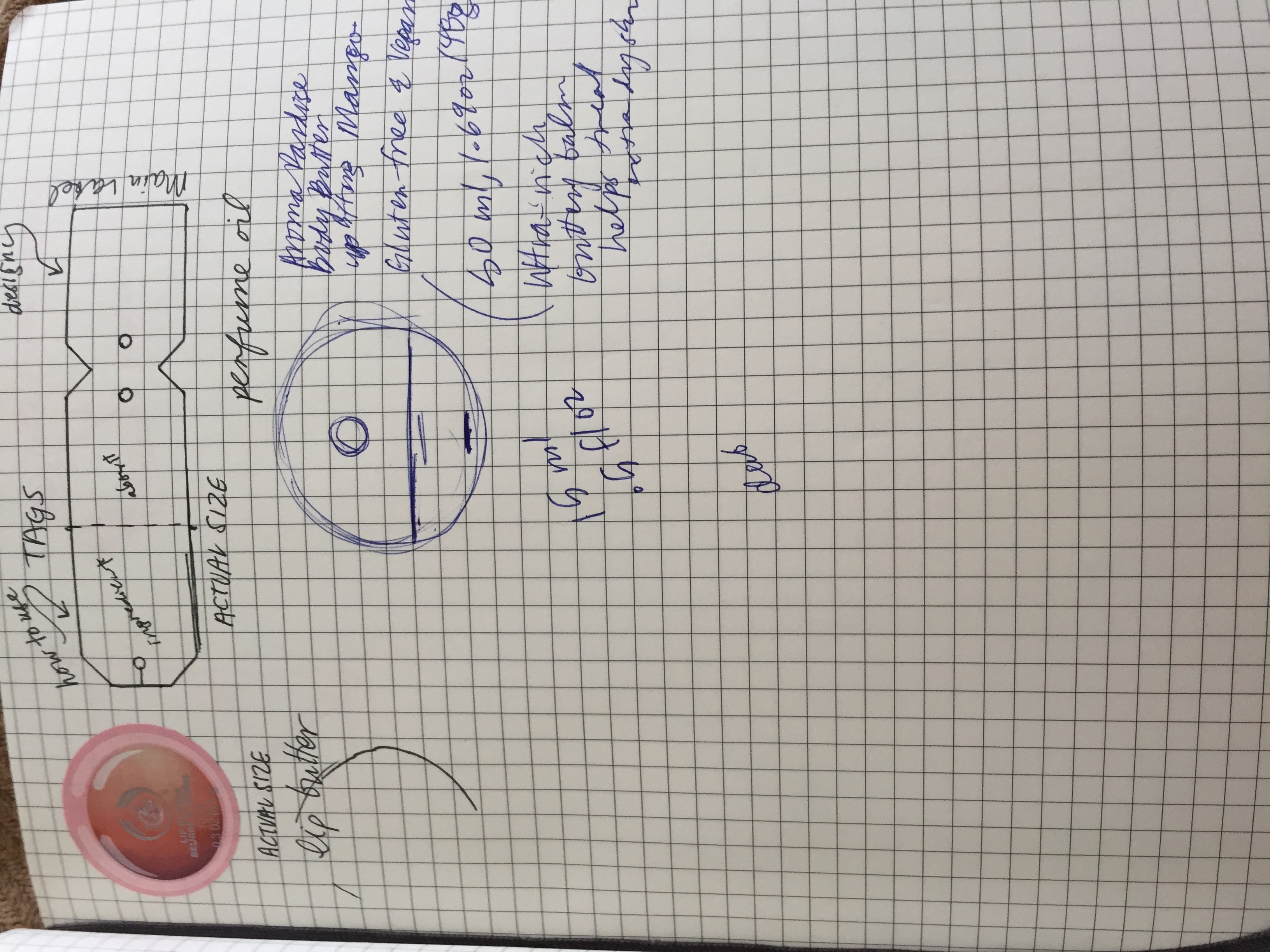
Creative Brief:
Explanation: Since Aroma Paradise makes custom scented products I thought, what better way to feature this than gift sets? My three gift sets differ in intent or use and the products included. Each item included features a custom designed label that keeps within the identity. Each box features all necessary information while surprising the viewer with that same explosion of paintings. Instead of tissue paper or foam I chose an all natural straw to cushion the boxes and to contrast with the modern white of the packages themselves.
Revisions: My main changes were to the labels to ensure readability. Across the packages I standardized the font treatments and I hand painted the handles to add another personal touch.
Something Extra
Astronomy Booklet


Creative Brief:
This little booklet was from my semester project for my Astronomy 1020 class. The only requirements were 10 pages, a specific age range, and focus on the sun in easy to understand explanations. I chose to make an activity book with a maze, fill in the blank, crossword, word search, and coloring pages. I'm actually really proud of this project (I received a 103). This book, once graded, was donated by the school. I hope you like reading it as much as I liked designing it.
Animations
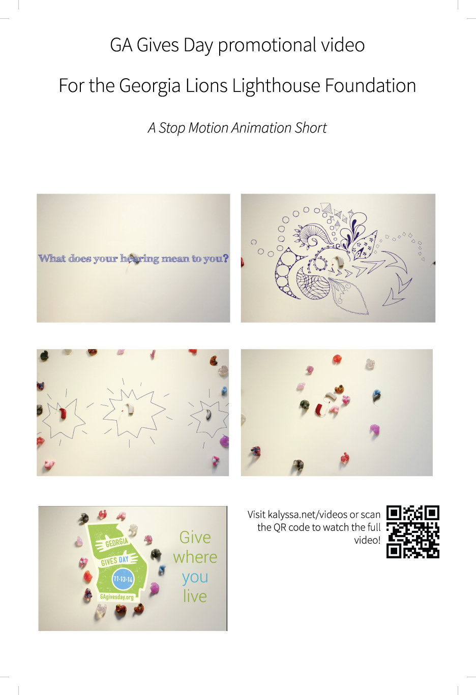

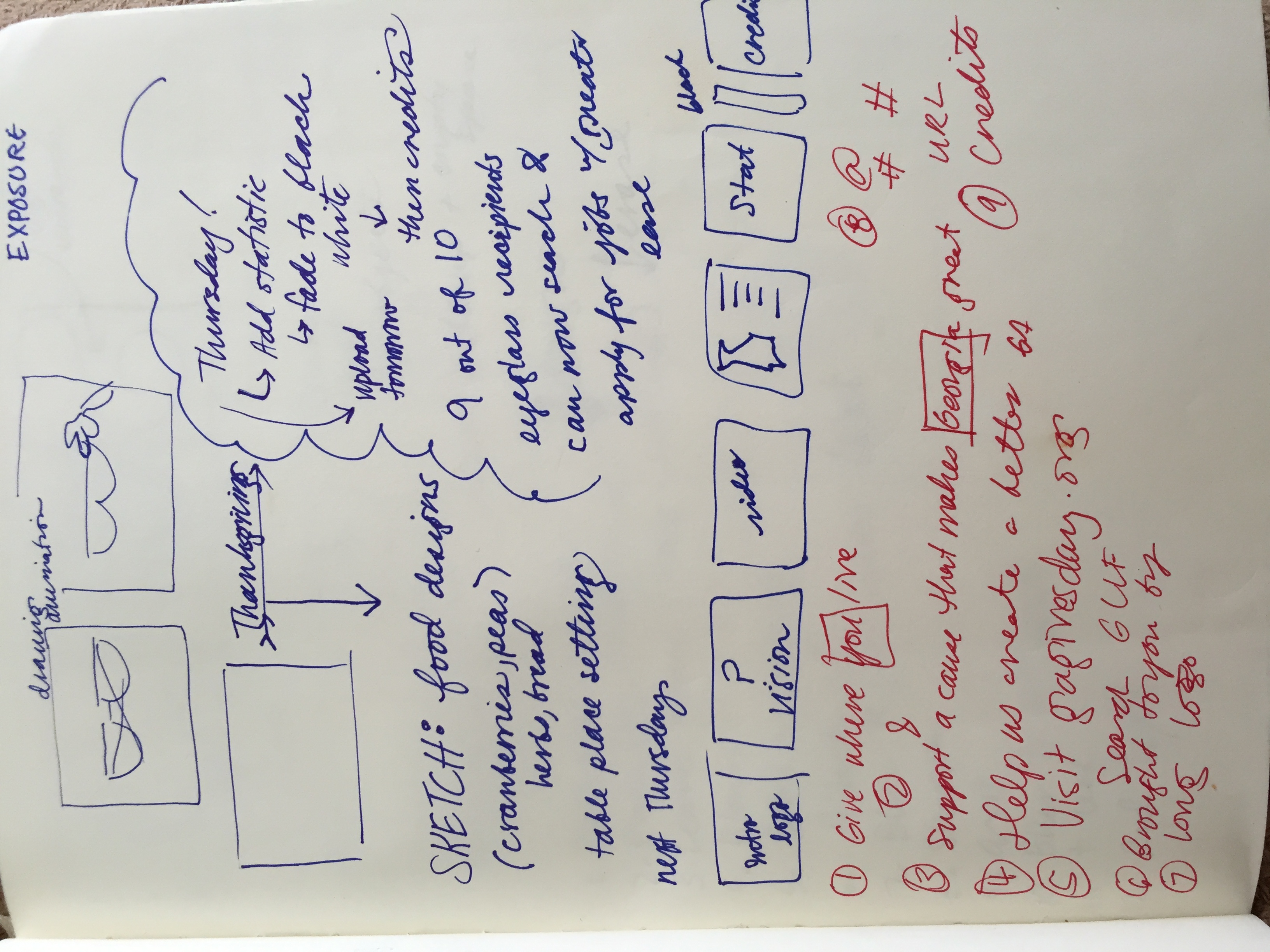

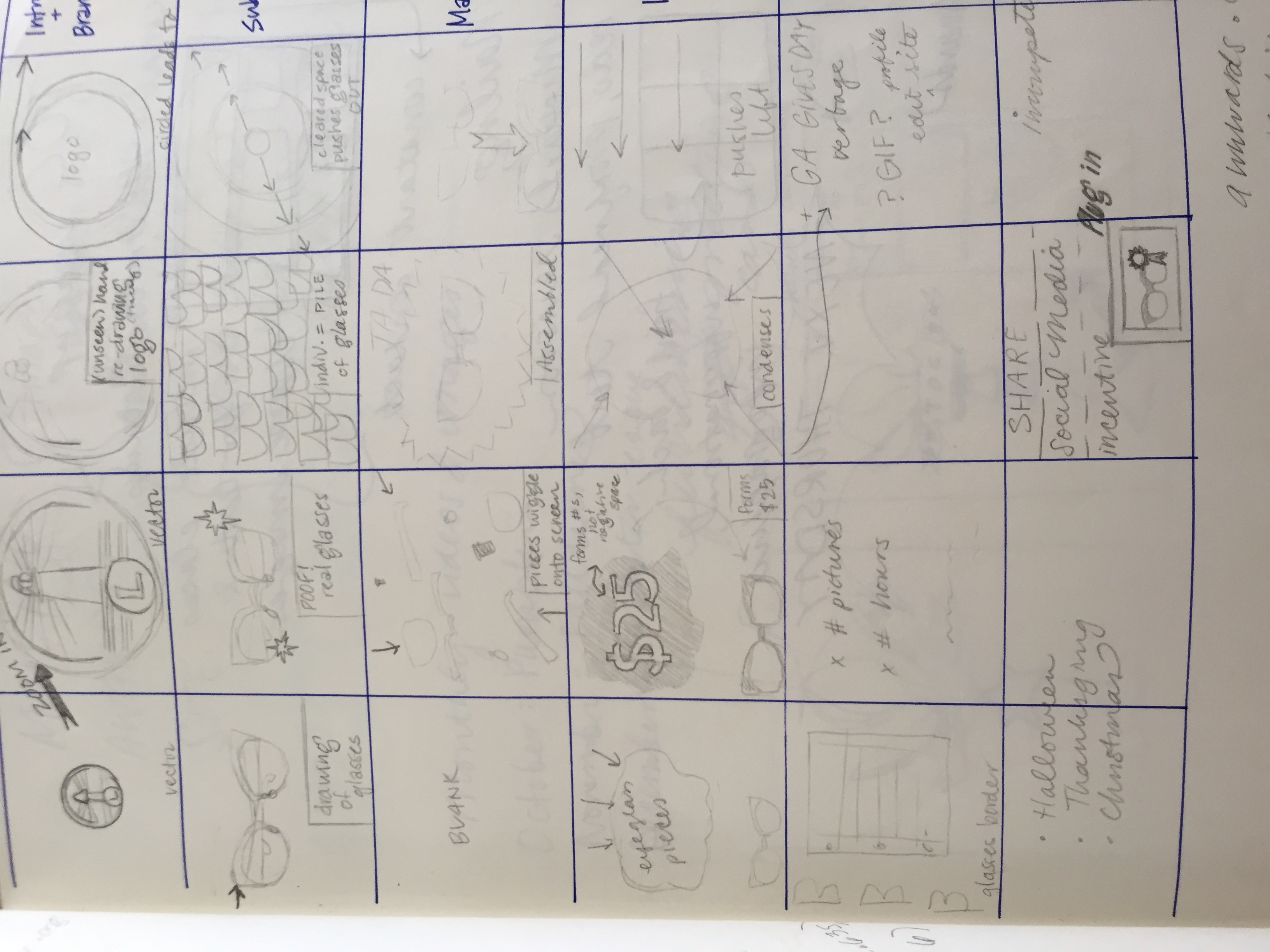


Creative Brief:
For my brief internship at the Georgia Lions Lighthouse Foundation I made four promotional videos. These videos were my first attempt at Adobe Flash and hand drawn animation. My exploration into stop motion photography is featured in my Happy Holidays video (yes those are my hands). I learned the methods by using simple Youtube tutorials (like this one) and lots of trial and error. My first video was the hearing aid video, followed by the vision video, the Halloween video, and finally the Thanksgiving video. Even though my internship ended, I'm still enormously proud of my efforts and can't wait to make more animations. Please take the time to watch a few of these, but if you had to choose one, I definitely recommend the Hearing video for Ga Gives Day.
Thank you for taking the time to evaluate all of my hard work. I want this opportunity so badly it hurts and I believe my passion is quite evident in my work. Again, thank you for this opportunity. I look forward to meeting you all.
Sincerely,
Kalyssa Raeanna Mariah Fuentes